
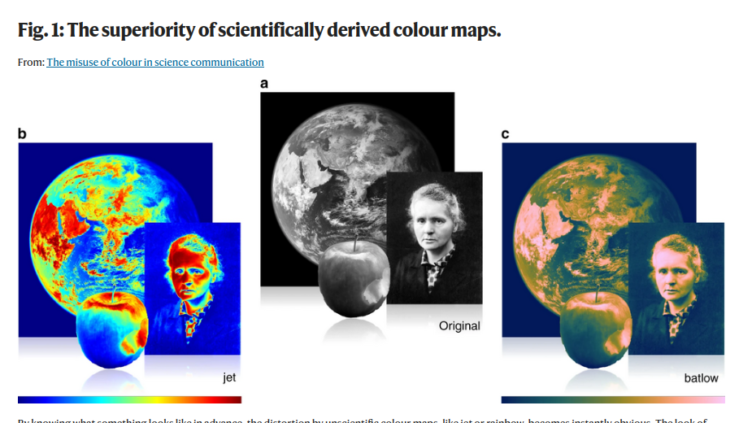
“The accurate representation of data is essential in science communication. However, colour maps that visually distort data through uneven colour gradients or are unreadable to those with colour-vision deficiency remain prevalent in science.”
[Crameri, F., Shephard, G.E. & Heron, P.J. The misuse of colour in science communication. Nat Commun 11, 5444 (2020). https://doi.org/10.1038/s41467-020-19160-7] This paper presents a simple guide for the scientific use of colour, showing how scientifically derived colour maps report true data variations, reduce complexity, and are accessible for people with colour-vision deficiencies.
Other useful resources, with colour schemes that are colour-blind safe and monochrome-printing safe, are the following websites:
https://personal.sron.nl/~pault/
https://www.fabiocrameri.ch/colourmaps/
You can find these and other resources in our External Resources page.